 Free UK Delivery on orders over £75
RGB vs CMYK
If you have ever sent a design to print and the colours came back looking a little different from your screen, the reason usually comes down to two short words: RGB and CMYK. They are simply the two ways of describing colour, one built for screens and one built for ink. Once you understand the difference, a lot of the guesswork disappears.
You do not need to be a colour scientist to get great results. This guide explains what is going on in plain English, shows you how to check your colours before you order and helps you decide which colour mode to send us.
So what are RGB and CMYK?
RGB stands for Red, Green and Blue. It is the colour mode your phone, laptop, camera and television all use. Screens create colour by mixing red, green and blue light, and because they add light together this is called an additive system. Turn all three up full and you get white. Turn them all off and you get black. Because RGB works with light, it can produce a huge range of bright, vivid colours, including the punchy blues, greens and oranges that seem to glow on a screen.
CMYK stands for Cyan, Magenta, Yellow and Key (black). It is the mode used for printing with ink and toner. Instead of adding light, ink works by absorbing it. Each layer takes some light away, which is why it is called a subtractive system. Put no ink on the page and you are left with white paper. Layer the ink up and you head towards black. CMYK has been the language of the print trade for decades, which is why so much printing advice talks about it.
Why can the colours change?
Every device can only reproduce a certain range of colours, and that range is called its gamut. A screen and ink on paper do not share the same gamut. It is not simply that print has "fewer" colours, the two ranges are a slightly different shape, so some colours sit inside one but outside the other. The shades most likely to change are the really bright, saturated ones: electric blues, vivid greens, bright oranges and neon pinks. On a glowing screen they look intense, but reproduced in print they can settle a little softer or more muted.
See it before you print: our CMYK Preview
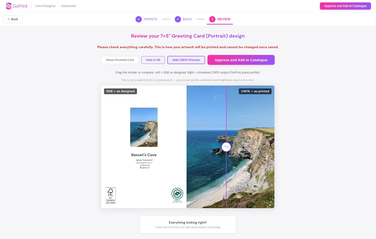
Rather than leave colour to chance, we have built a CMYK Preview into the designer's review stage and into our image editor. It shows you a closer approximation of how your artwork will print than the bright, backlit RGB version on your screen. Colours that fall outside what we can print are shown at the nearest printable colour, so you can see at a glance which shades will shift and if you want, nudge them to a better compromise in the image editor before you order.
The preview uses a single, cautious standard rather than your exact paper, because you choose your stock later in the catalogue. We deliberately base it on an uncoated paper profile, which is the smallest of our colour ranges. That makes it a safe "worst case": if a colour holds up in the preview, it will hold on any of our papers.
RGB or CMYK: which should you send?
There is no single right answer here, just a trade-off, so it is worth knowing both sides.
Designing online with our tool? Your artwork reaches us as RGB, and our presses convert it to the widest range of colour they can produce. This is the best route for maximum vibrancy and your colours can come back a touch richer than the preview showed.
Working offline in our downloadable templates? You have a choice. You can keep your file in RGB and let us convert it, or you can convert to CMYK yourself and soft-proof on a calibrated screen. Converting to CMYK is the most predictable route: what you proof is very close to what you get. The trade-off is that you may give up a little of the extra colour the press could have reached from an RGB file.
In short: RGB gives you the most colour, CMYK gives you the most predictable match. Neither is wrong. If in doubt, design online or send RGB and check the preview, and order a printed proof for any new design before committing to a full run.
Colour is about more than RGB and CMYK
Two more things shape how a print looks, and neither is about your file.
First, the paper itself. Paper has its own colour, or white point, and it tints everything printed on it. A warm-toned paper such as our Warm Cotton gives the whole print a softer, creamier feel, while a brighter, whiter paper such as our Bright stock looks cooler and crisper. The same file can look noticeably different on each, so it is worth choosing your paper with the mood of the artwork in mind.
Second, the light you view it under. Some papers contain optical brightening agents (OBAs), which react to the ultraviolet in daylight to make the paper appear whiter and brighter. Under warm indoor lighting that effect fades, so the same print can look brighter by a window than under a lamp. This is completely normal. If a print matters, it is worth viewing it in the light where it will finally hang or be displayed.
A note on fine-art giclee prints
Everything above is about our digital press, which prints with four toner colours (CMYK). Our giclee prints are different. They are produced on a large-format inkjet printer using twelve inks, which reproduces a far wider range of colour than four toner colours can. Our giclee papers, Museum Heritage, Portrait White and PhotoArt Silk (all from PermaJet), are made for exactly this, so giclee work should stay in RGB. There is no need to convert to CMYK and doing so would only throw colour away.
If your image was captured in a very wide space such as ProPhoto, or shot in RAW, export it to a wide-gamut RGB profile such as Adobe RGB (1998) rather than sRGB. That keeps more of the colour your image holds, and our giclee papers can reproduce more of it than a digital press could. If you are working in sRGB that is still perfectly fine, you simply have a little less headroom in the most saturated colours.
Setting up your files
To give us the best starting point when you design offline:
- Design at 300 DPI at the final print size for crisp, sharp results.
- Staying in RGB? Choose sRGB if your software asks, and embed the profile on export. For giclee from a wide-gamut original, Adobe RGB (1998) is better.
- Converting to CMYK? Use the FOGRA52 profile to match our preview, and soft-proof before you export.
- Save as a PDF (or JPEG or PNG) unless we have asked for something specific.
Designing with our online tool
If you create your artwork in our online design tool, you do not need to think about RGB, CMYK, profiles or DPI at all. The tool works in the right colour space, lets you check colours with the CMYK Preview, and exports a print-ready file automatically. We have put together a separate step-by-step setup guide, with a short video, that walks you through your first design from start to finish. (Link to the setup guide goes here once it is published.)
Quick checklist
- Designing on screen? You are already in RGB.
- Want maximum colour? Design online or send RGB.
- Want a predictable match offline? Convert to CMYK (FOGRA52) and soft-proof.
- Ordering giclee? Stay in RGB, and use Adobe RGB (1998) for wide-gamut originals.
- Always check bright colours in the CMYK Preview before ordering.
- New design or critical colour? Order a printed proof.
- Using our online design tool? It is all handled for you.
Frequently asked questions
Should I convert my files to CMYK before sending them?
Only if you want the most predictable result and you are working offline on our digital-press products. Converting to CMYK (FOGRA52) and soft-proofing means what you see is very close to what you get. If you would rather have the richest colour, send RGB and let our presses make the most of it. For giclee prints, always stay in RGB. And if you design in our online tool, there is nothing to convert.
Why do my prints look duller than my screen?
A screen emits light, which always looks brighter and more vivid than ink or toner reflecting off paper. Very saturated blues, greens and oranges are the usual culprits. It does not mean anything is wrong with your file. It is simply the difference between glowing light and a printed surface. Our coated stocks, Ultra White and Coated, tend to look closer to your screen than our uncoated papers such as Bright, Textured and Warm Cotton, and a printed proof shows you exactly what to expect.
What is the CMYK Preview actually showing me?
A closer approximation of the printed result than the bright RGB version on screen. It uses a cautious, uncoated colour profile that is the smallest of our ranges, so it errs on the safe side. Colours we cannot print are shown at the nearest colour we can. If a colour holds up in the preview it will hold on any of our papers, and on our coated stocks, Ultra White and Coated, it will often look better than the preview suggests.
Will my print look as muted as the preview?
Usually no. The preview is based on an uncoated paper profile on purpose, as a worst case, and four of our six card stocks are uncoated, so it is a fair guide for most of the range. Our two coated stocks, Ultra White (satin) and Coated (silk), have a wider colour range, so prints on those come back more vibrant than the preview showed.
What is sRGB, and why do you recommend it?
sRGB is the most common RGB colour profile and the default for most cameras, phones and websites. Crucially, most monitors and laptops are built to show the sRGB range too, so it is what the majority of people are actually seeing on screen. Wider ranges such as Adobe RGB (1998) and DCI-P3 exist on wide-gamut displays used for colour-critical work, but they are far less common, so sRGB is the most reliable, widely understood starting point. The exception is giclee from a wide-gamut original, where Adobe RGB (1998) is worth keeping.
For the technically minded, what profiles and settings do you use?
We profile our presses to two industry-standard references: FOGRA51 (PSO Coated v3) for our coated stocks, and FOGRA52 (PSO Uncoated v3) for uncoated. Both are modern profiles that account for the optical brighteners in today's papers. Our on-screen preview uses FOGRA52, the smallest gamut, as a deliberate worst case. We convert using the relative colorimetric rendering intent with black point compensation, which keeps every printable colour accurate and maps only the out-of-gamut colours to the nearest colour we can print. On the press itself we output to the full range the press can achieve, which in some colours is wider than the FOGRA52 preview, so an RGB file can come back a little richer than the preview suggested. Our digital press uses four toner colours, whereas our giclee prints use a twelve-ink inkjet process with a considerably wider gamut, which is why we keep that work in RGB.
Still not sure which way to go with your colours? Just get in touch and we will happily talk it through.
Alternatively order a printed proof to check prior to placing a main order as colours may appear differently on screen compared to once printed.